Tuesday, July 1, 2008

Eric Ringsby's sublime Rodeo Series


I'll admit I've got a soft spot for rodeo imagery and subsequently have represented a few bodies of work directly relating to the subject. By my love of the genre has nothing to do with the traditions normally seen within it, rather they are a direct connection to personal upbringing and the absurdist nature of the sport. My years in Idaho proved to be filled with unusual entertainment rituals and of course rodeo was one of them. It was really the only solo bonding experience that I had with my father while growing up, as he loved to go to the rodeo and I was the only one in the family that didn't refuse to go out to the stadium with him when the rodeo came through town.

Eric Ringsby was the first artist whose work I witnessed who portrayed the sport in a contemporary vein, my first exposure of which occured at the MCA Denver's Colorado Biennial the first year I moved to Denver (and easily one of the strongest years for that exhibition). Ringsby was venturing into the realm of video, and utilized rawhide canvases to project images of rodeo onto (both in large and small-scale versions), and also exhibited a series of large format giclee prints on canvas that captured single frame video images of riders in action (of wich this piece is from). The pixelization that occurs through this technique lends itself well to the action that Ringsby captures and though I don't like the giclee concept in general, the use of it had a distinct appeal and rationale that fit the works. It is one of the largest pieces in our collection and one that both Karen and I are very fond of. We ended up meeting Eric and his family and since have become close friends. Eric used to be involved in a gallery operation in NYC when we had first opened up in Denver, and we essentially met because of the unusual parallels between our respective positions. Eric was essentially fronting a gallery that had the name "Cornell Dewitt Gallery" while our gallery name was originally "Cordell Taylor Gallery" in honor of my friend and associate Cordell Taylor who was the inspiration for the business. People used to constantly get the two confused, at least here in Denver, but eventually Eric ended up getting out of the business, which was unfortunate as it was a great conduit for Denver artists to the NY market (due to Eric being a Denver native), but ever since he has kept a close eye on Plus Gallery and remains one of the leading authorities in the area on contemporary art, both as a patron and as a collector.

Thursday, June 12, 2008

Hunt Rettig's "Back Footpath"


Past couple of weeks have been super busy, likely the next couple will be too but wanted to squeeze in some words on our latest major acquisition, an assemblage piece by Hunt Rettig, part of a pseudo-triptych called "Back Footpath." Rettig is an exciting artist with a gallery backstory that I love to relate. One day late in 2003(I think) I got a call about 15 minutes before hosting a wine-tasting event, something we used to do in the early days to get exposure for the gallery. These were frantic events, a lot of anticipation before and major clean-up (not to mention hangover) the next day. Needless to say I had little patience for anyone calling on other business minutes prior, let alone a brand new artist seeking representation. The artist who called that day gave me a story about being from Aspen and down for the day, he had just visited Robischon (widely considered, both then and now, the best contemporary gallery in town) who had told them that he should contact us and might be a good fit for our program. Now, it is quite often that you get this or a similar line, but usual not in relation to Robischon, so at the time even though I had no desire for an artist visit, I nevertheless gave enough pause for Rettig to find an in. I told him I didn't want him coming inside the gallery because of the event, but would meet him in the alley and take a quick peek, hoping I could dismiss him easily and not have to create a scene inside. I'll never forget that moment, as the artist agreed and took little time in showing me a small sample of his work and shoving a portfolio in my hands with a cover that was pure magic. All I could think was that the only reason Robischon passed him up was due to him being 100% green..... the work had a definite magnetic energy and character that was fresh and full of potential. I told him quickly that I would keep a hold of the portfolio (which I still have to this day) and get back to him. He was a good guy, didn't need to have his hand held or any promises made, mostly I suspect because he knew he was onto something special (and being from Aspen didn't hurt, in fact he had been recognized by the illustrious curator Dean Sobel from the Aspen Art Museum, now director of the Clyfford Still Museum, with his early works). I was pretty excited when I got back into the gallery and showed the portfolio to my associate Gilbert, trying to relate the back-alley conversation as best I could without losing focus on the task at hand. The next day upon further analysis we both agreed that we might give this guy a shot and in fact ended up working him into an exhbition that would mark the first major transition of the gallery the following year, when we brought on board a third player into the gallery, the widely known and esteemed gallerist Ron Judish. The rest of that story is too long to relate here, but essentially Hunt's debut was enough of a success on our end to get excited about his future potential, though issues surrounding the quality of his work did surface, proving Robischon's assesment of his being distinctly green. But the best part of the art business has always been taking risks and honing talent, and Hunt has ended up proving himself greatly......not quite to the extent as someone like William Betts, but his path has been pure and pretty remarkable. I still feel that he has created a very singular concept that cannot be repeated or transgressed through other methods to create a similar result. The best thing as that he has truly come to understand the depth of his technique and how to apply it in different directions that will make him very succesful and highly collectible, in fact he's one of the few artists we represent that has a valued collector list like no other, much of that due to his position in Aspen, one of the hottest scenes in the world. He's still a very cool and humble guy, but with just enough of a randy edge to be worth working with. This particular piece is part of a recent trio called "Back Footpath," which to me signified a distinctly exciting new understanding in his work, particularly at a smaller scale. We were fortunate to pick it up recently, fully knowing that a future acquisition would likely be way out of our price range. The work itself will always be a mystery. Hunt uses thin poly-films in a way that is super simple to understand yet completely incomprehensible in how he wields them to achieve the magical results. Most people think his works are photographs, but once you see how the curved areas capture light to create shifting hot-spots and different colors, you know more or less that there's a lot more in it than meets the eye. Almost impossible to capture the quality of with an image, which to me relates to some of the best art always.

Tuesday, June 3, 2008

An early Jenny Morgan triptych


The story of Jenny Morgan and our gallery is an astonishing one that we often relate to friends and prospctive clients alike with great fervor, there really has been no other artist that has hit such tremendous personal and career notes in a small time-span. The short version is that she served as our very first intern at the gallery years ago when she was in her final year at the Rocky Mountain College of Art and Design. Jenny was a great intern, though at that time responsibilities didn't extend much beyond cleaning the floor, labeling postcards and serving bar at the openings. Though Jenny was studying painting, she never revealed her work to us during her internship but did invite us to the graduation show at RMCAD where she had a piece on view. Because she was such a delight and always did what we asked of her, we decided to support her show and attended the opening. The painting she had on view was obviously the standout of the show, it was a triptych that had three tightly cropped depictions of a naked female body in a state of flow, with fabric swirling through the body, each panel with a different color-tone referencing various emotional states. She had a precise technique but the cropping and color selections made the piece distinctly contemporary. I liked it enough to ask her to bring it to the gallery and see what might happen, it wasn't necessarily a genre that I would see us getting into but it seemed very appealing with just the right edge we were looking for. Some months later Jenny invited us to her first exhibition at Pirate, a local co-op that long held one of the best reputations in town (thanks to leadership by local legend Phil Bender and a disarmingly good array of talent over the years). It was an honor that Jenny was accepted into Pirate, and of course we wanted to support her first show. The best part was that I was indeed suprised by what she had on view, the exhibition showed great depth and intrigue and the contemporary nature we had assumed she was encompassing was in full view. I was very taken in particular by this "Belly" triptych, it seemed like such an unusual choice for a young artist and promoted a dichotomy in content that I felt was very strong, both repelant yet divine at the same time. The piece was all of $250 and I decided to snatch it up the night of the opening. Since that time so much has transpired with Jenny's career, she has become one of the top artists in our stable and there are many wonderful, exciting stories surrounding her rise in the Denver art scene and beyond, too many to be related here. She just graduated two weeks ago with a masters in painting from one of the best art schools in the country (NYC's SVA) and her work has alrady been secured by notable national collectors such as Howard Tullman and Norman Dubrow. Though she emerged as one of the most promising artists from Denver in the last ten years, she is really just now beginning her real career and time will tell if the magic of her early days will continue as she commences painting in her new Brooklyn studio. I for one am banking that it will.

Tuesday, May 27, 2008

Bruce Price "Frieze Fragment #3"


Plus Galleries first exhibition with Bruce Price was "The New York Paintings" in 2004 in a pairing that also marked the debut of Michael Whiting. It was a fabulous show with equal recognition given to both artists by the press and public alike, though Price's work was later recognized by Mary Voelz Chandler of the Rocky Mountain News as one of the best exhibitions across the board that year (including institutional shows) and he was also noted as Denver's top Abstract painter by the RMNEWS as well. The major works in the exhibition were diamond-shaped canvases that referenced major cultural figures whose work dealt with concepts of patterning and ornamentation, each pattern on the canvas built up through a hundred or more layers of paint. The effect of building the paint up in this fashion led to an edge treatment that was imprecise and curled over off the edge of the canvas in a highly appealing manner. The surfaces of the paintings had a distinctly rigid, plastic look, a result of the layering and intrinsic quality of acrylic paint and gel medium. The minor pieces including "Frieze Fragment #3" stood out in a similar fashion though with a slightly looser pattern structure and thicker sense of layering. I fell in love with the Frieze Fragments and ended up aquiring one a couple years after the exhibition when finances allowed. They are still some of my favorite works by Price and a period of his evolution that I think will always stand as a high point (including acquisitions from the show by renowned architect David Adjaye during his initial visits to Denver after being selected to design the new MCA Denver).

Monday, May 26, 2008

Michael Whiting's "Greater Times"


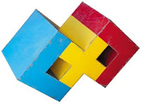
Michael Whiting is one of my favorite sculptors that we represent at the gallery and "Greater Times" is from his exhibition "I'm a Square" which took place in October of 2005. It was really one of the most blissed out shows of color and form that we've ever showcased and really a huge development for Michael in terms of the level of complexity and the sheer pleasure inherent in the works. "Greater Times" is one of the show-pieces that really resonated with me from the title itself (which had a lot to bear on our current frame of mind that year) down to the level of execution that is one of the artists first use of three colors within a 3-dimensional work. Michael's concept is to create minimalist forms along the lines of early pixel-based computer technology, primarily with direct references to early video-games. What's truly remarkable about this concept is that it appeals to a wide variety of sensibilities, the gaming reference really only striking a small percentage of his collectors (who are generally more drawn to his exceptional massing and precise construction of forms). Whiting finishes each piece with automotive paint which he then distresses to create a "relic" of modern times. The exhibition was a big success and fortunately my wife decided to buy this piece for me for christmas that year. Michael continues to build upon his premise unabated with major public commissions in the works and two of his most recent sculptures from 2007's "Walk in the Park" having recently been selected for a public exhibition in Colorado Springs juried by the esteemed curator Adam Lerner (from the Lab at Belmar).

Thursday, May 22, 2008

Our son Udo in a digital masterpiece


When our son Udo was born in June of 2007, just a couple of weeks later if even that, the Denver-based artist John Bonath contacted us and said that he was looking for a fresh baby to utilize in one of his digital photographs. I was excited by this prospect as I had shown John's work before in a group exhibition and was familiar with his output, he is simply put one of the greatest digital photographers in the world (and I don't say that lightly). The digital medium itself is not necessarily highly sought or regarded in Denver but I've always felt that if John was located elsewhere that he would be huge, his work and ideas really are exceptional. We told him that we'd love to have Udo be involved, for us it was really a way to have Udo connected to art from the very start, and once John explained the magnitude of the piece it was even more exciting to be involved. The finished digital composition is enormous, there are three panels that make up more than twelve feet of space if not more. The effect is absolutely stunning to see in person, and John has hopes that the work will be accepted into the upcoming Rocky Mountain Biennal held in Fort Collins, CO, and of course if it is we'll have fun taking Udo up to see the piece in its full glory. But John is very generous and put together a maquet for us that is on stretched canvas and framed up nicely, it is hung above our bed and the total dimension of the maquet is about 50 inches or so. The more Udo the merrier, that's what I think of the piece though you really have to see the work closeup to tell the extraordinary detail of the multiplications of our son.

Tuesday, May 20, 2008

K-tabs to make you feel better


This is a small piece that I bought for Karen for Christmas a couple of years back. Its from Ellen Castrone, a UCD student whose work I was introduced to as a result of my being finagled (or hired) to jury the BFA Thesis exhibitions at the downtown Denver school that year. I really enjoyed the duties, and in particular the ability to get in touch with the artists that were part of the program (which is not always considered the strongest in denver but continually has produced exceptional artists and has a truly great teaching staff). I really enjoyed Castrone's work, which was a grid of small paintings all depicting various pills, most of which I had no idea what they were, painted in a dimensional way on top of old dress patterns. Definitely art-schoolish but fun and I where else could I find a piece that could so well represent Karen in an off-beat way? She likes it and it resides above our toilet in our current bathroom (not a bad place at all for artwork, by the way). I haven't heard from the artist since but think she may have moved onto greener or substantially more intense art-pastures.